Improving the Information Architecture of a Government Website

First 5 San Bernardino’s website needed to improve the user experience for the staff, public, parents, professionals, contractors, native Spanish-language audiences, and political stakeholders. The website is more of a repository of information due to government public record policies.
ROLE
User Interface Designer
Information Architect
SOLUTION
Fix limited usability for staff with a refreshed user interface and information architecture.
RESEARCH
No previous analytics data due to legacy hosting system and lack of resources
Scope of work did not accommodate for user research or usability study
PERSONAS
By observing First 5’s activities, I was able to identify 6 key user personas for the brand’s website.

COMPETITOR ANALYSIS
I reviewed 51 sister-agency websites to determine potential design solutions.
Analyzing other agencies’ approach to communicate information and tell their stories of impact provided options for user interface features that should be emphasized in the proposed solution.
Two examples became the leading UI and Information Architecture examples and were adopted in the proposed information architecture solution.
INFORMATION ARCHITECTURE
Site Map

CONSTRAINTS
DotNetNuke is the CMS platform for the County of San Bernardino’s network of websites for public-facing agencies. My task was to turn over deliverables of a designed UI where ISD could implement content management modules for us to continue to populate the content of the website including public documents, public meetings, media, and text.
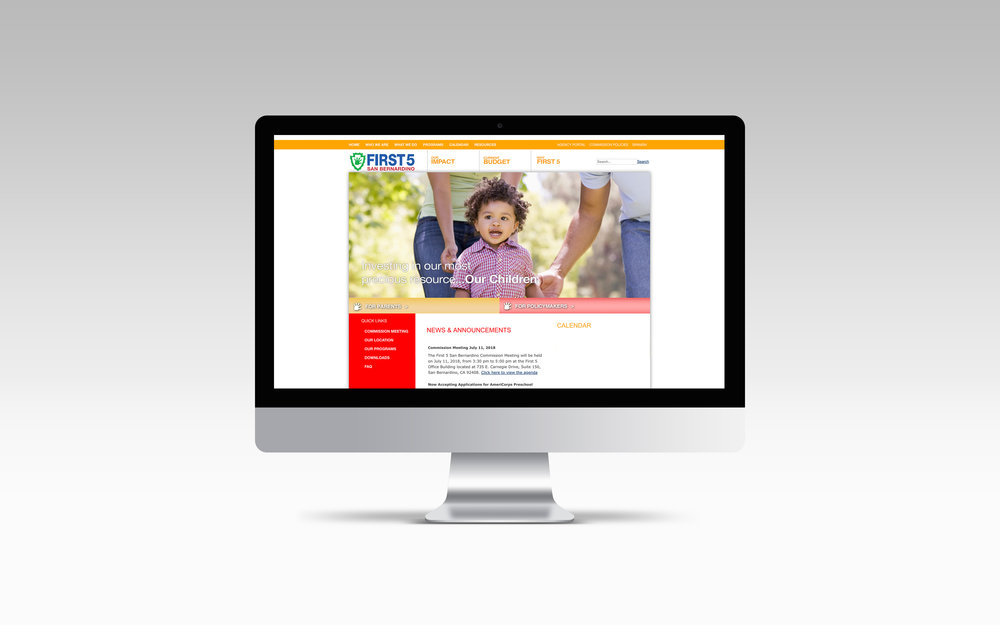
LAYOUT DESIGN
The content management design would have to be as simple as possible, with a primary and secondary layout only. The primary layout would be implemented on the main page with secondary pages hosting site content.

COLOR, TONE & PHOTOGRAPHY
The color theme for the site was based on the organization’s brand identity. Orange was incorporated to complement the brand colors, with the green color tone conveyed through hero images.
Guiding Principles for Stock Photography:
Diversity in age, ethnicity, gender & family structure
Closeup shots with expressive children, demonstrating social-emotional wellness


Outcome
RESULTS
User interface outline became a model for a sister-agency website redesign in 2018
Evaluation department increased efficiency in service and operations with the ability to directly communicate with contractors